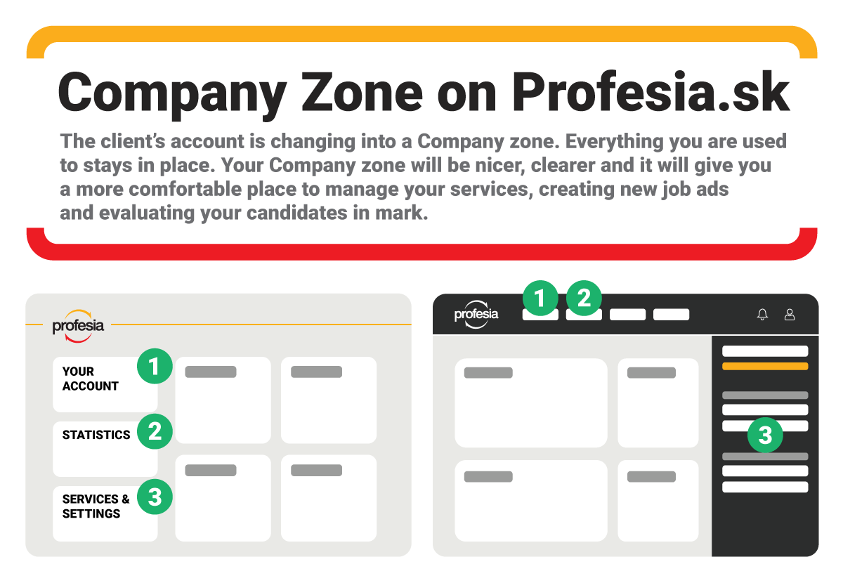
We’d like to introduce the Company zone – an improved client’s account
The client’s account in Profesia is getting a facelift. A new design will bring more clarity and new ways how to work with resumes. Let’s take a look at what we have prepared.
A new design for the Company zone
We dressed the Company zone in black. So, take out your fictional tuxedos and little black dresses and let’s see how your company zone will look. The client’s account is changing into Company zone. All features you are used to are staying in place. We tweaked the design so the client section and job seekers section would visually differ. The Company zone has gotten more sophisticated and business look in elegant black and white combination.
The top bar menu will help with navigation
After login, you’ll get to the main page, where you can quickly and easily find the most important features. The top bar menu in black will offer easy navigation. It will get you to your job ads, into the CV database and to the mark – a section for evaluating candidates who applied for your job ad. You will find your services and settings by clicking on an upper right icon.

A new way how to evaluate candidates for all
A new feature that we have integrated in the Company zone and made accessible for all clients is mark – a tool which you can use to work with received applications. Say no to messy tables, chaotic e-mail inboxes and mismatched files. Now, everyone can try to evaluate and select applications in a modern and efficient way. Thanks to a pipeline system you can move each candidate from the first round to the second up to the final candidate.
The new Company zone has all the necessary features for your successful hiring process in one place.